Mechanistic Exploration Gemma 2 List Generation
Abstract
Sparse Autoencoders (SAEs) have recently emerged as powerful tools for exploring the mechanisms of large language models (LLMs) with greater granularity compared to previous methods. Despite the great potential of SAEs, concrete and non-trivial applications remain elusive (with honorable mentions for Goodfire AI and Golden Gate Claude). This situation motivated the present investigation into how Gemma 2 2b Instructed generates lists. Specifically, an exploratory analysis is conducted to understand how the model determines when to end a list. To this extent a suit of SAEs known as GemmaScope is used. Although initial traction has been gained on this problem, a concrete mechanism remains elusive. However, several key results are significant for how MI should approach non-trivial problems.
1. Introduction
Gemma 2 2b is a small language model created by Google and made public in the summer of 2024. This model was released alongside a suite of Sparse Autoencoders and Transcoders trained on its activations in various locations.
Despite its size, the model is incredibly capable, excelling in its instruction-tuned variant with the ability to follow instructions and demonstrating performance similar to the original GPT-3 model on some benchmarks.
These facts make Gemma 2 2b a great candidate for performing Mechanistic Interpretability (MI) experiments, offering an excellent balance between performance and size.
I will explore the mechanisms behind Gemma 2 2b’s ability to create lists of items when prompted. Specifically, I will focus on the mechanism by which Gemma knows when to end a list.
Reasons why this task is interesting
- Due to Gemma 2’s larger vocabulary, it is easy to create one-token-per-item list templates, avoiding the complications of position indexing.
- The instruction tuning of the model enables the induction of different behaviors in model responses with minimal changes in the prompt.
- The open-endedness of this task allows for consideration of sampling dynamics in the model’s decoding process (such as temperature and sampling method).
- The template structure enables a clear analysis of very broad properties of the model, like “list ending behavior,” using proxies such as the probability of outputting a hyphen after a list item, which clearly indicates that the list is about to continue.
I will assume some level of familiarity of the reader with Sparse Autoencoders in the context of mechanistic interpretability.
2.Data
To investigate the behavior of Gemma when asked for a list synthetic dataset of model responses to several templates.
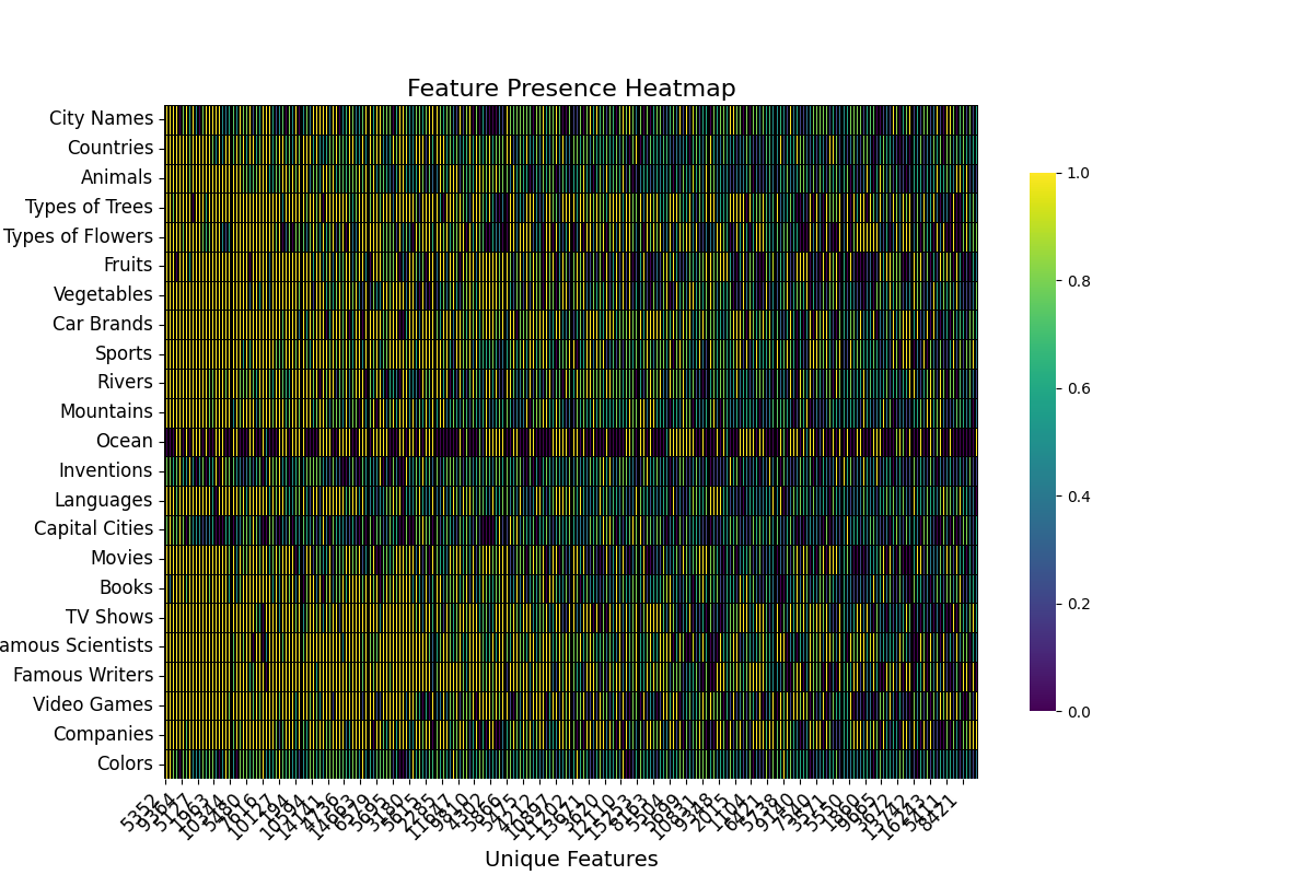
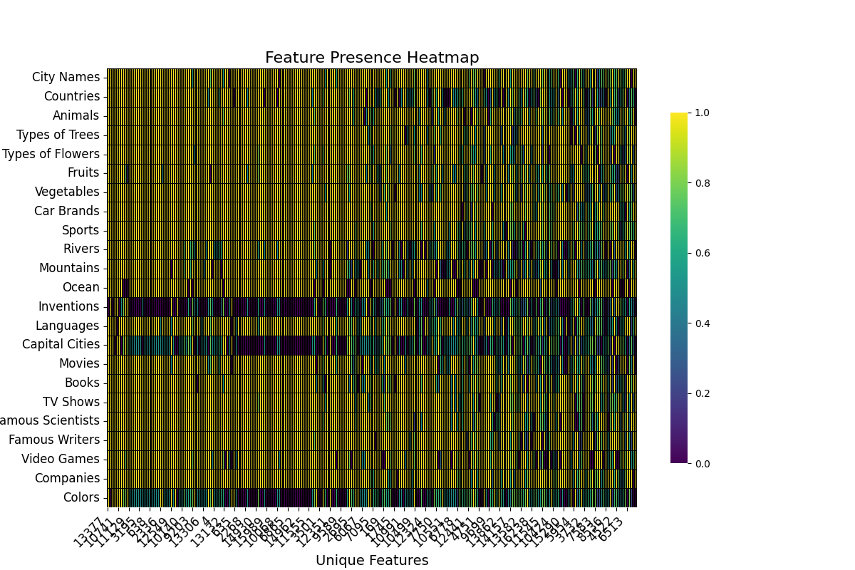
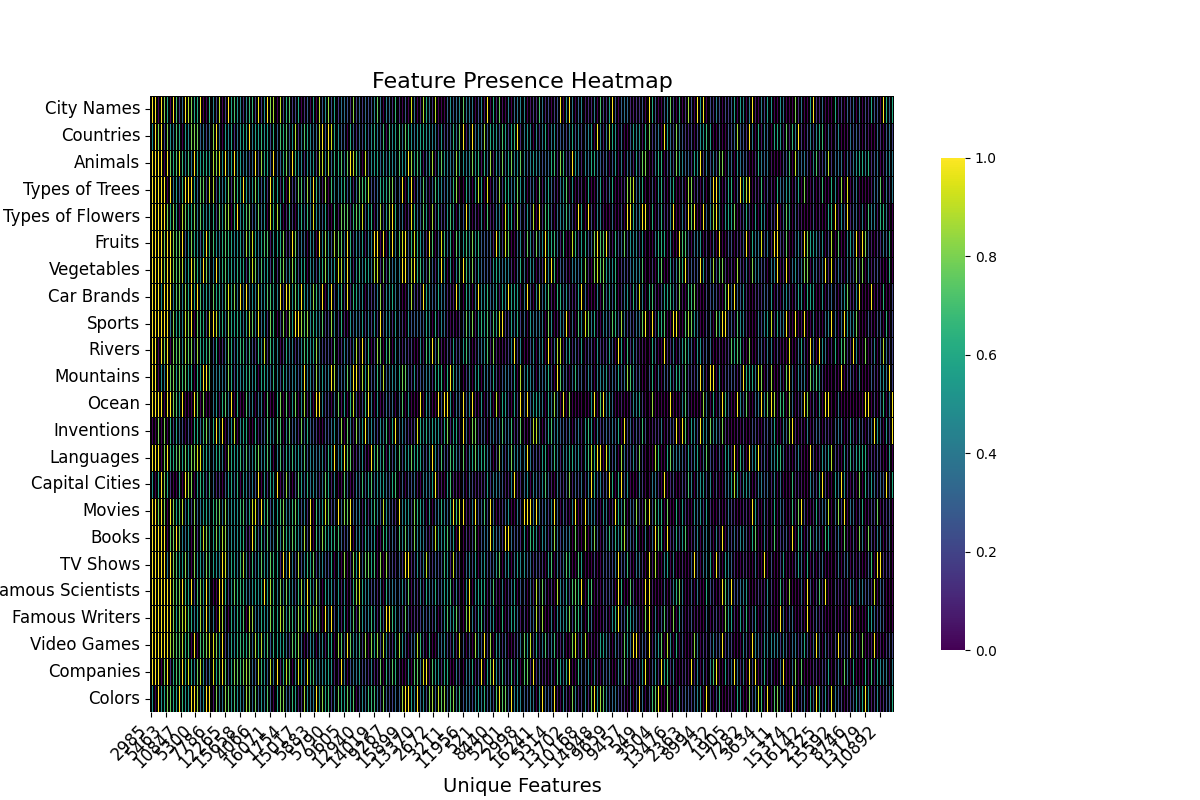
1) Ask GPT4-o to provide a list of topics to create lists about.
This results in 23 final topics, these topics will be used in the templates to prompt Gemma 2 to create lists about them.
Some examples, of those are: *Vegetables, Countries, Movies, Colors, etc
2) A prompt is defined to get the model to return lists.
Template 1 (Base)
Provide me a with short list of {topic}. Just provide the names, no need for any other information.
Template 2 (Contrastive)
Provide me a with long list of {topic}. Just provide the names, no need for any other information.
Template 3
Provide me a with list of {topic}. Just provide the names, no need for any other information.
If not otherwise indicated, all the analysis and explorations were done with template 1
3) For each topic, 5 samples of Gemma Completions with top-k = 0.9 and temperature=0.8 are drawn.
This step is crucial, because as can be seen in the Appendix actually sampling completions from Gemma allow us to observe the actual dynamics of the list ending behavior when compared with List Generated by GPT4o
3. Exploratory Analysis
We start the Analysis with an exploratory overview of the completions provided by the model. Few things that struck me as interesting, are the apparent consistency on the type of list that the model produces for a given template across topics, temperatures and samples, the tendency of the model of using filler blank tokens before ending the list.
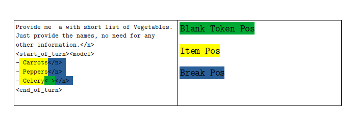
Provide me  a with short list of Vegetables.
Just provide the names, no need for any other information.</n>
<start_of_turn><model>
- Carrots</n>
- Peppers</n>
- Celery< ></n>
<end_of_turn>
1) Most of the item’s in the list were a single token.
As expected most of the item in the lists generated spanned just a single token, virtue of the large size of Gemma’s vocabulary.
Plot of the number of items across topics and temperatures for Template 1
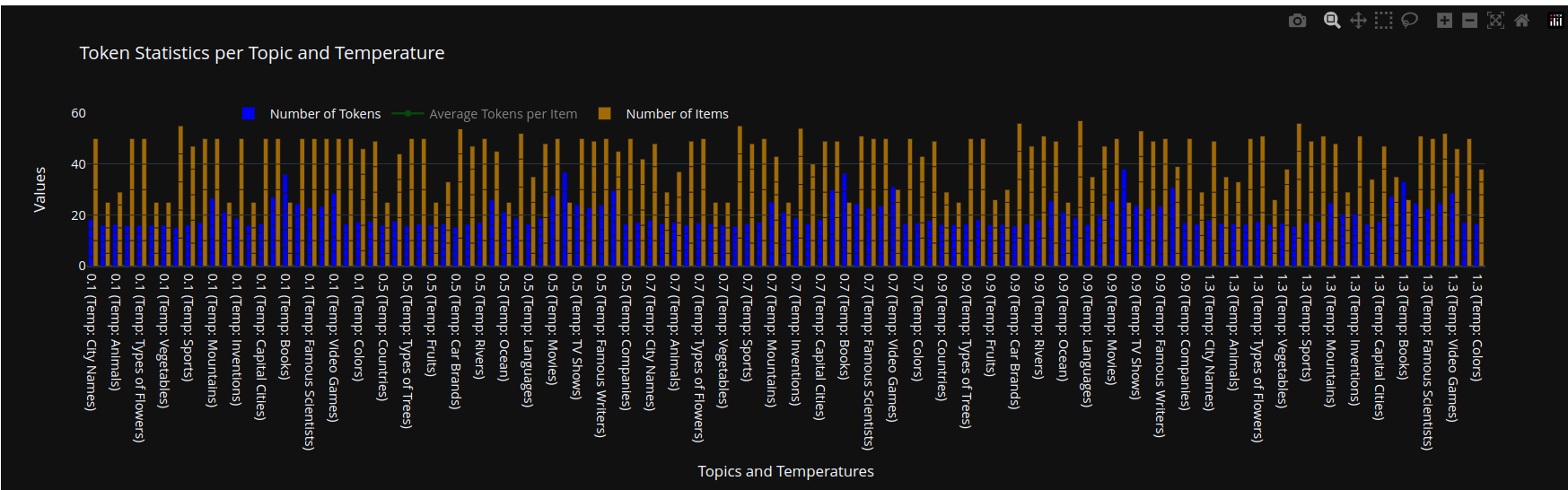
For our prompt template, and with a few and notable exceptions most of the items in the lists were one-token long, this is likely a result of the expanded vocabulary size of Gemma 2 (roughly 5 times bigger than the one from GPT2 models). Some notable exceptions were topics like Oceans, Cities or Countries.
2) For all the topics, in the last few items in the list the model sampled white space tokens after the item and before the line break.
Average number of tokens for each Item across topics, and temperatures (taking into account the hyphen and line break token 1+1+1)
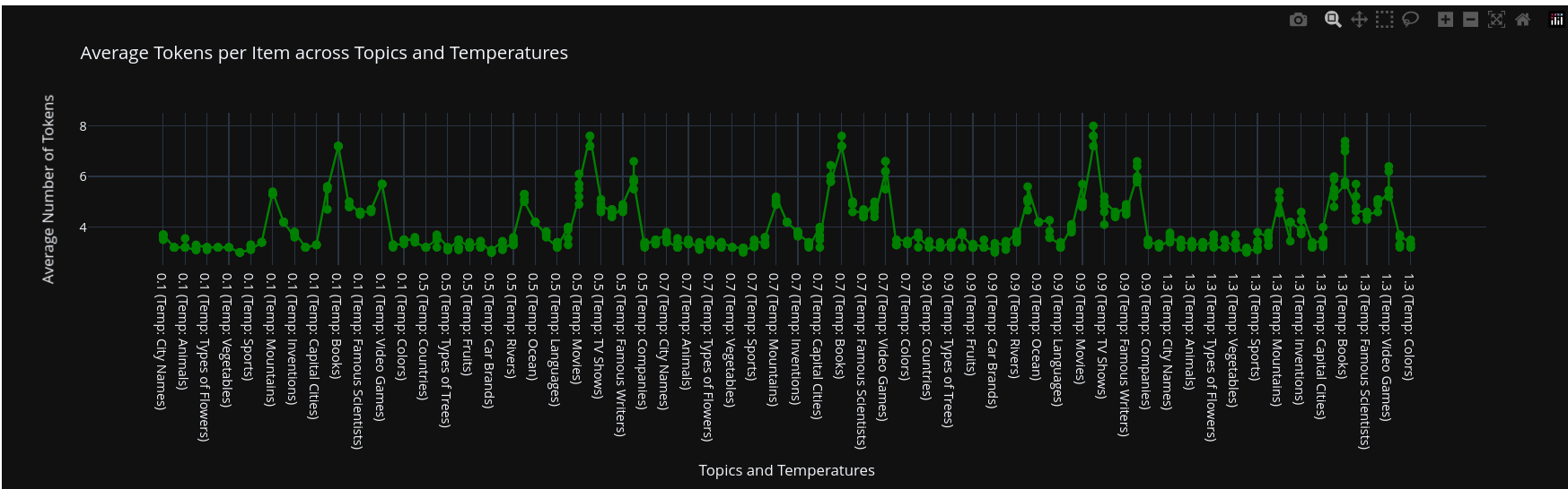
By far the most interesting behavior that we’ve observed trough different topics and temperatures is the model behavior of including blank tokens near the end of the list.
This is very speculative, and I don’t have and hard prove but this is maybe an RLHF/Post Training artifact
We further investigate this behavior using attribution techniques.
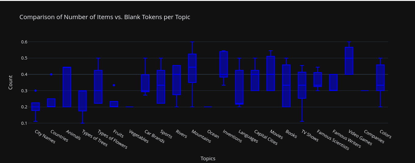
3) The number of items in each list with a white space added is pretty consistent across topics, with a few outliers.
In most of the cases just the last item in the list had the blank token, this was not the case though for some topics were more than just the last item had the strange blank token.
4) The number of items in each list is also very similar across topics.
5) There exist a correlation between the sampling temperature and the number of items in a list with a blank spaces token before the end of the list.
This is expected, given the fact that greater temperatures, might push the model to miss on the end of the list due to chance.
6) For prompts, were we asked for a long list, the average number of items is 30, and we no longer observe an abudance of white space tokens at the end of the list.
Table with the number of items generated for each template, across topics and samples.
| Template | Average Number of Items |
|---|---|
| Template 1 | 5 |
| Template 2 | 30 |
| Template 1 | 10 |
The numbers are approximate, in reality outlires skew the average
3.5. Entropy Analysis
When doing Mechansitic Interpretability analysis on Model Generated Outputs is very important to remember that the distribution of outputs for the model is not the same as the distribution of general text on the web or books.
This is one of the possible explanations behind the phenomena of AI Models preferring their own text.
One exploratory metrics that we can analyze is the evolution of the entropy of the models logits.
Concretely focus on the entropy at the item positions over the whole dataset.
This means that if a generated list has 5 items, we take entropy readings in 5 different places
This was done to the whole dataset of generated outputs for templates 1 and 2. To get a better understanding of the entropy we also corrupted the prompt for templates 1 and 2 in the following way.
-
Template 1: Clean
Provide me with a short list of ... - Item 1 \n Item 2 ... -
Template 1: Corrupted (Short $\rarr$ Long)
Provide me with a long list of ... - Item 1 \n Item 2 ... -
Template 2: Clean
Provide me with a long list of ... - Item 1 \n Item 2 ... -
Template 1: Corrupted (Long $\rarr$ Short)
Provide me with a short list of ... - Item 1 \n Item 2 ...
The arrow indicates that the token “ short” or “ long” were replaced while maintaining the rest of the Instruction + Generated List intact.
It’s important to note that the generated lists either long or short were not changed, just the short/long token.
Also note, tat there’s a left padding hence the x-axis size is not representative of the average number of items in generated lists.
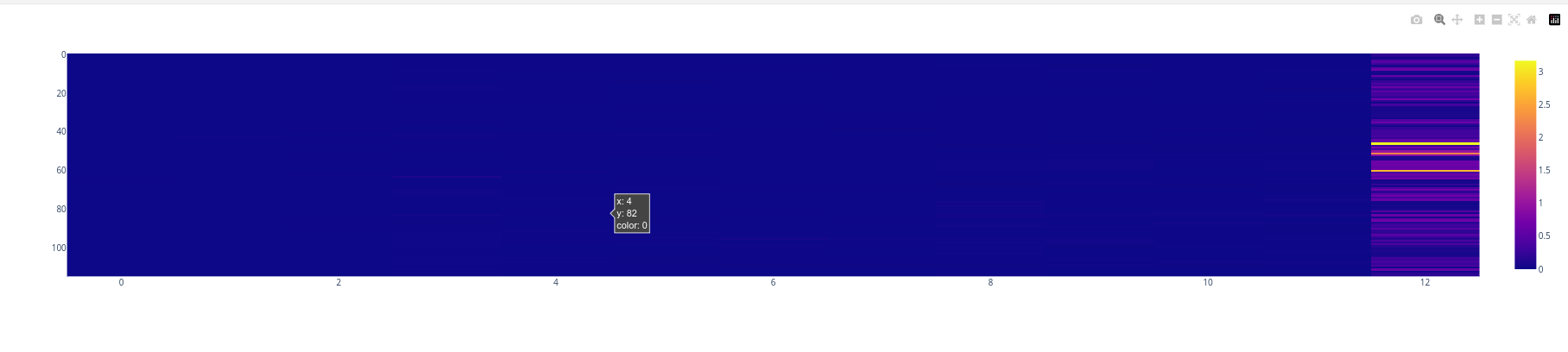
Template 1 Clean
For the generated outputs of the model with the base prompt we have the following entropy plot.
We can clearly see how the entropy increase is gradual trough out the item positions, with a slight increase at the last positions.
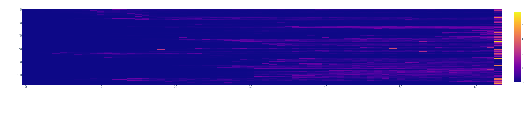
Template 1 Corrupt
If we corrupt this base prompts by interchanging the token “ short” with the token “ long” and leaving everything else (including the generate list) intact.
We observe that there’s no increase in entropy over the item positions, the entropy just increases at the last position.
Which might indicate that the model wasn’t expecting the list to end due to introduced specification that asked for a long list.
Template 2 Clean
We can also do the opposite analysis, we can generate completions for prompts asking for long lists (Template 2).
Again we see a gradual increase in the model’s entropy as the list approaches it’s end.
Template 2 Corrupt
If we corrupt this prompts by interchanging the token “ long” with “ short” and leaving everything else (including the generated list) intact.
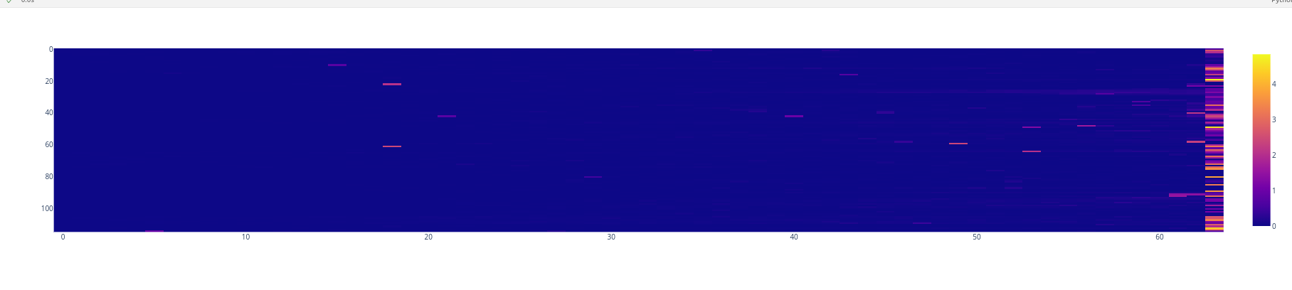
We can see an abrupt spike in entropy similar to the analogous case with Template 1.
4. First Approximations
Structure of the Prompt+Generation
Just the tokens that are difficult to infer are indicated
To investigate what is the mechanism behind Gemma ending a list, we must establish a proxy for it.
Given the nature of the problem it’s easy to establish proxies for the behavior of ending a list:
There’s several way in which we can approach it.
-
The list ends when the model outputs the
token instead of a new hyphen token . *This can be operationalized like the difference between predicting the
vs <-> tokens at the last </n> position* This seems to me to be the most natural way to go about this problem, still this approach was discarded in favor of the following.
-
The list ends when the model uses a blank filler token, instead of the usual line break.
This approach leverage the experimental findings from the previous section to establish a proxy for when the model finishes the list. This can be operationalized like the difference between predicting the < > vs <\n> tokens at the last < Celery> position
At first this can seem a little bit convoluted and unjustified, but this make’s more sense when you realize using the first approach wouldn’t account for the effect of the blank token that precedes the </n> token.
Logit Lens
We investigate the logit difference between the blank and line break tokens (which we can call “list ending behavior”).
Taking advantage of the shared RS across layers, we can use the unembedding matrix to project the activations across the layers into vocabulary space.
This enables us to get an intuition of how a behavior builds trough the layers.
Using such technique we inspect the relevant positions for the list ending behavior across the dataset.
We use the difference between decoder’s < > and <\n> direction as the list ending direction, to inspect the activations trough the layers.
In the example above the relevant positions would be the once corresponding to Carrots, Peppers and Celery.
We plot the logit difference across layers for the various positions of interest
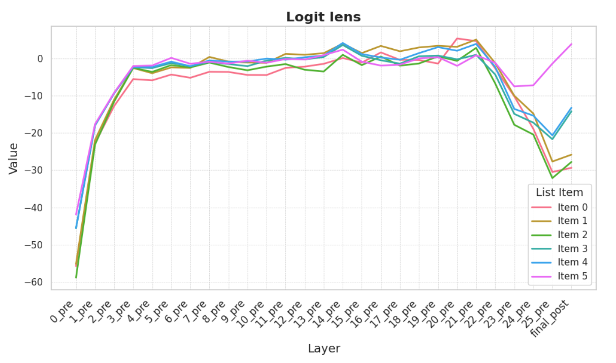
We can see that the 5th item is the first one to clearly have positive logit difference. A progressive increase in logit lens can be seen trough out the items.
The layers 20 to 26 seem the most relevant when it comes to express this direction.
This behavior can also be seen trough out the whole dataset, with slight variations.
6. Sparse Autoencoders
Following the release of Gemma 2 2b, Google Deep Mind released a suite of sparse autoencoders trained of the model activations with multiple levels of sparsity, location, and dictionary size.
The decision of which SAE’s to select for a given experiment should we be made carefully, taking into accounts multiple factors like reconstruction loss vs sparsity and dictionary size vs available memory.
For this investigation we used SAE’s trained on the RS and attention outputs, with dictionary size of 16k (for ease of use), and we selected the sparsity based on availability of explanations in Nueronpedia
One problem that is apparent to anyone that has tried to use Sparse Autoencoders for real world task is that the memory footprint of SAE experiments rapidly explodes as we add layers.
For reference a 2b model and 2 x 16k SAEs filled RTX3090’s memory when grads were enabled.
The intuitive solution to this problem is to come up with heuristics to select a few layers to use SAEs in, to maximize the faithfulness/GB vram ratio.
Possible heuristics are:
- Use Logit Lens style techniques to select the most important layers.
- Use ablation over positions and layers to select the most important layers. (Some discounting should be done to no give too much importance to the last position or last layers)
Proper benchmarks are needed to rate this heuristics, this is outside the scope of this investigation.
In the investigation we selected 5 layers for RS SAEs and 5 layers for Attn SAEs with mixture of patching and guessing by plots.
| SAE | Layers |
|---|---|
| Attn | 2, 7, 14, 18, 22 |
| RS | 0, 5, 10, 15, 20 |
Attribution
Given the vast number of features that get activated in the dataset it’s important to pin down the most important features for the behavior we are investigating, to do so we use Attribution techniques.
Concretely we wan to obtain the most important features that explain a given metric. This metric should reflect the behavior we are interested in.
In this case, given that we are interested in the “list ending behavior” a suitable metric can be the logit difference between the blank token and the line break token logits, at the position just before the end of the list.
We run attribution experiments for all the Attention and RS SAEs (one by one) across all the dataset, and keep the top (pos, feature) tuples.
This results in a large collection of feature, for various layers and model components that are relevant for the list ending behavior.
With this collection of features we can proceed to visualize, the overlap of the important features, which hopefully will reveal some structure.
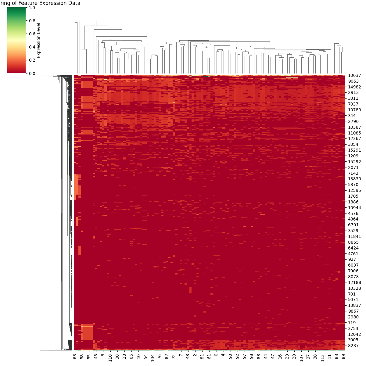
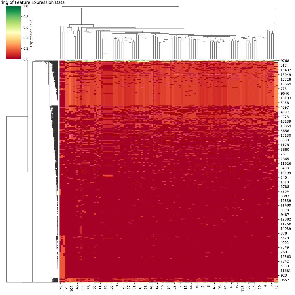
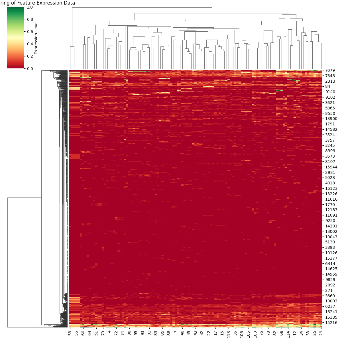
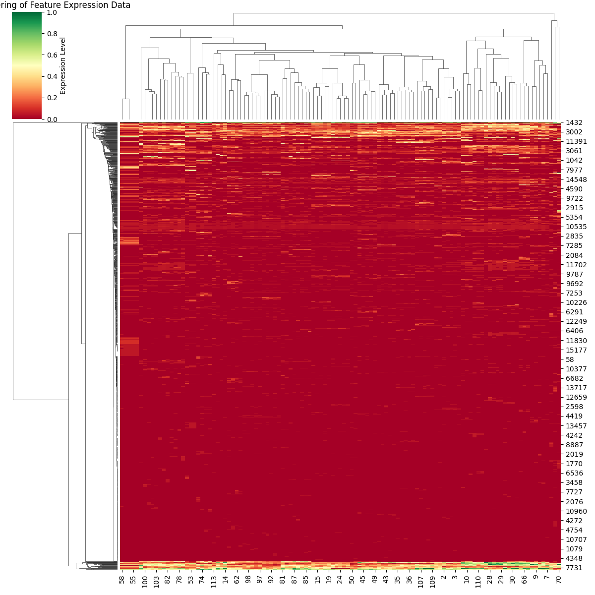
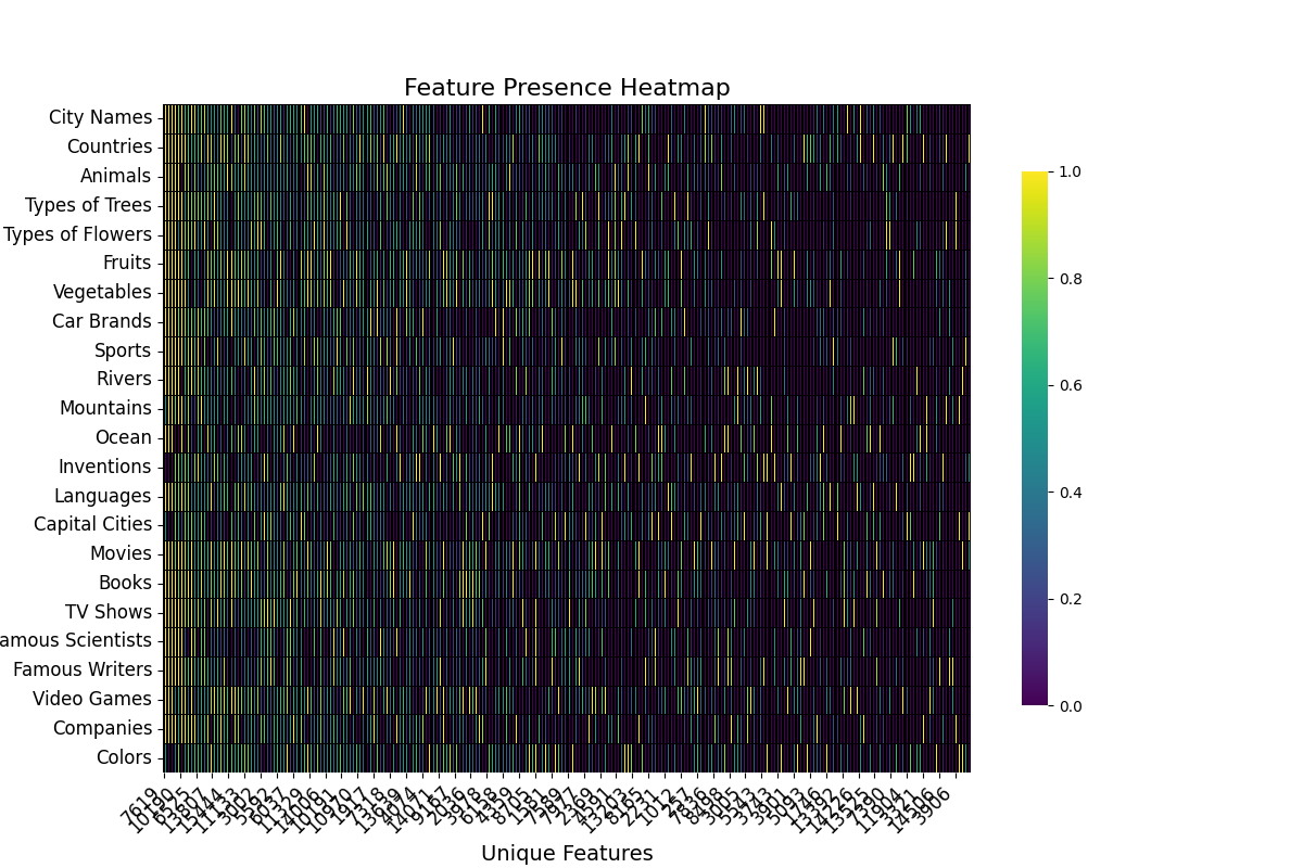
To aid in the visualization of the features we employ Heat maps and Cluster Maps.
Cluster Maps
Loosely inspired by the visualization tool used in bioinformatics known as the “Gene Expression Matrix,” we plot the most important features for a given layer and component across the entire dataset.
The x-axis corresponds to the different samples, while the y-axis represents the important features. We visualize the degree of feature expression as the normalized activation of each feature in the samples. Hierarchical clustering is performed on both the features and the samples.
 |
 |
|---|---|
| Clustermap Res 5 | Clustermap Res 20 |
 |
 |
| Clustermap Attn 7 | Clustermap Attn 14 |
The basic information that these plots provide is whether there are communities of features that strongly activate for a subset of samples. Given that the dataset is composed of samples from various topics, some local communities are expected to exist.
One example of a “local community” would be the lower-left corner of the RS5 cluster map.
In contrast, the lightly colored areas that span from one side to the other in the cluster maps correspond to features that are important for explaining the metric across the entire dataset.
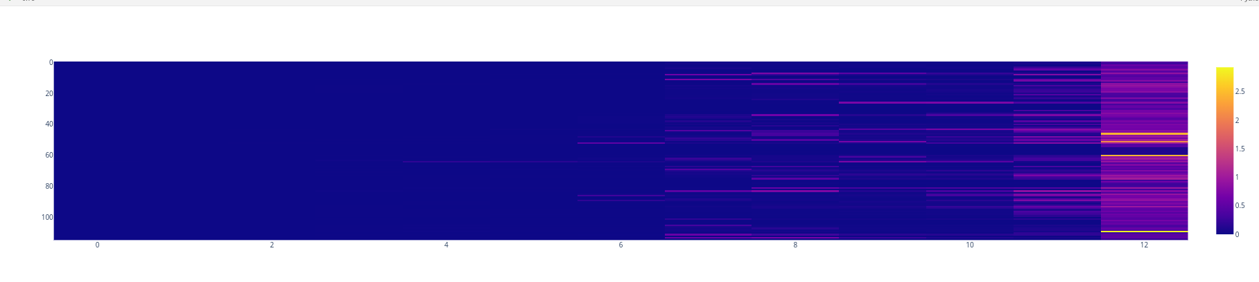
Heatmaps
Heatmaps are another visualization tool that helps us visualize which features are important for explaining the metric across the whole dataset.
For ease of visualization, in this case, the activations were aggregated across topics. The basic information that these plots provide is whether or not there are communities of features that strongly activate for a subset of samples. Given that the dataset is composed of samples for various topics some local communities are expected to exists.
 |
 |
|---|---|
| Clustermap Res 5 | Clustermap Res 20 |
 |
 |
| Clustermap Attn 7 | Clustermap Attn 14 |
This type of visualization is very useful for understanding the dispersion of important features throughout the layers and components.
For example, we can see that the important features for the RS in layer 20 are much more homogeneous than the important features for the Attention Output in layer 14.
Feature Explanations
Some cherry-picked examples of important features trough-out the dataset.
| Feature | Explanation |
|---|---|
| att_2_5935 | Attends to the term “short” from associated terms that follow in the sequence |
| res_20_1491 | Formatting or structural elements in the text |
| res_0_16057 | Instances of the word “sign” or related variations |
| att_22_7623 | Attends to tokens that end with punctuation marks |
| att_14_6034 | Attends to punctuation marks from selected preceding tokens |
| res_20_2045 | Repeated elements or patterns in the text |
| res_10_12277 | Mentions of quantities, particularly focusing on “three” and “four” |
After inspecting the most important features across multiple layers and components, several conclusions can be drawn:
- Given a dataset and a metric, there exist at least two families of features: features that are important across the entire dataset and features that are important for a subset of the dataset.
- It is crucial to properly weigh the evidence provided by the explanations of features, as their behavior in the dataset distribution may differ slightly.
- Some features are sensitive, such as short features or those that activate only on the last element of a list, so one must be careful with the conclusions drawn.
7. Causal Ablation of SAE Features Across the Layers
Once we have a broad understanding of the most important features that explain a given metric, we must set up experiments to empirically test whether these features affect the behavior we are interested in as expected.
To this end, we performed causal ablation experiments that involved setting the top five most important (position, features) to zero and generating completions. This allowed us to investigate whether the list-ending behavior was maintained.
As of 10/14, it is my understanding that this type of ablation is not supported in SAELens for Gemma 2 2b due to a bug in the JumpReLU implementation GitHub Issue — the solution is a one-liner.
Method
- For a given component and layer in SAE (one by one):
- For each sample, we zero-ablate the top five (position, features).
- Then we generate completions (without any other ablation) and record key metrics.
Metrics
- Number of items
- Shannon Index for items across a topic
- Number of tokens
- Number of repeated items for each generation
These metrics are important because early experiments showed that some ablations resulted in the model not ending the list but instead entering a loop where it repeated some items over and over again.
Average difference between base and ablation
After running the ablation experiments for each SAE being studied, the results are as follows:
The table below reports some statistics for the element-wise difference between the generation with ablation and the base generation metrics.
Specifically, we report the following:
- Average S-Index difference across a topic
- Variance in S-Index difference across a topic
- Average number of items difference across a topic
- Variance in number of items difference across a topic
| Feature | diversity_mean | diversity_variance | n_items_mean | n_items_variance |
|---|---|---|---|---|
| Animals | 0.322300 | 0.179901 | 8.371429 | 32.371429 |
| Books | 0.289517 | 0.118605 | 4.807143 | 13.842857 |
| Capital Cities | 0.145818 | 0.082653 | 8.052381 | 35.028571 |
| Car Brands | 0.279907 | 0.060890 | 8.780952 | 22.542857 |
| City Names | 0.155626 | 0.041292 | 5.421429 | 16.814286 |
| Colors | 0.327869 | 0.191291 | 8.426190 | 30.985714 |
| Companies | 0.102732 | 0.048914 | 5.259524 | 21.985714 |
| Countries | 0.318873 | 0.129684 | 7.290476 | 25.600000 |
| Famous Scientists | 0.048153 | 0.003429 | 0.533333 | 0.342857 |
| Famous Writers | 0.105085 | 0.032860 | 2.757143 | 8.685714 |
| Fruits | 0.387794 | 0.083724 | 6.297619 | 15.214286 |
| Inventions | 0.208251 | 0.088154 | 9.502381 | 37.300000 |
| Languages | 0.421391 | 0.257328 | 10.019048 | 37.542857 |
| Mountains | 0.436039 | 0.134403 | 8.673810 | 23.900000 |
| Movies | 0.370672 | 0.177356 | 6.178571 | 19.214286 |
| Ocean | 0.104637 | 0.087586 | 2.683333 | 10.957143 |
| Rivers | 0.112220 | 0.031009 | 2.326190 | 7.385714 |
| Sports | 0.061543 | 0.012598 | 1.326190 | 3.385714 |
| TV Shows | 0.188230 | 0.051777 | 6.240476 | 19.300000 |
| Types of Flowers | 0.021870 | 0.005216 | 0.366667 | 0.771429 |
| Types of Trees | 0.111400 | 0.035255 | 3.771429 | 13.771429 |
| Vegetables | 0.335448 | 0.094947 | 4.721429 | 10.042857 |
| Video Games | 0.411398 | 0.107417 | 3.838095 | 5.742857 |
We can see that for most of the topics, the main metric that we care about, the Mean difference in number of items, is greater thatn 1, which indicates a suppression of the list ending behavior after the ablation.
Average difference between base and ablation
If we aggregate the relevant metrics across the different SAEs we can observe that some of them have a larger effect in suppressing the list ending behavior.
| diversity_mean | diversity_variance | n_items_mean | n_items_variance | |
|---|---|---|---|---|
| attn_layer_14 | 0.111443 | 0.048028 | 1.963043 | 6.213043 |
| attn_layer_18 | 0.065051 | 0.028595 | 0.718116 | 1.526087 |
| attn_layer_2 | 0.221969 | 0.064955 | 3.265217 | 8.373913 |
| attn_layer_22 | 0.069707 | 0.035557 | 0.989855 | 2.765217 |
| attn_layer_7 | 0.177179 | 0.043048 | 1.983333 | 3.073913 |
| res_layer_0 | 0.628397 | 0.325129 | 22.221739 | 82.069565 |
| res_layer_7 | 0.329185 | 0.080516 | 7.098551 | 21.591304 |
One impressive example of this, is the SAE in the RS in layer 0, upon close inspection, the top-5 features for this SAE were very related to the short token, after ablation the average number of items is close to the Template 2.
For the other SAEs the resulting number of tokens was close to the Template 3.
The SAEs with less than 1 extra item in average can be classified as not effective at suppressing the list ending behavior.
Conclusions and Future Directions
In summary, applying Mechanistic Interpretability techniques to real-world problems is not straightforward, and many compromises and assumptions must be made. This work aims to be a first approximation in using MI techniques in scenarios that more closely resemble the real world.
Although some progress has been made in addressing this problem, this investigation falls short of the goals of mechanistic interpretability.
As a developing field, I perceive that there is still no consensus on the level of proof required to assert that something is governed by a certain mechanism.
While the empirical results are encouraging (full elimination of the list-ending behavior with just five edits), the results are not entirely satisfactory.
Even though ablating some key features prevents the list-ending behavior, other simple methods, such as restricted sampling or steering vectors, can achieve similar results. MI techniques like those used in this investigation should be benchmarked against these simpler alternatives.
Future Work
There are many aspects that have been left out of this first exploration that would be interesting as follow-up work:
- Benchmarking different heuristics for selecting layers (memory vs. circuit faithfulness)
- Applying known techniques for feature explanation to the dataset of interest
- Using transcoders and hierarchical attribution to obtain full linear circuits. Open MOSS Hierarchical Attribution Related Post